Accent Amazing has a new logo!
Accent Amazing has a new logo!
For the past month I've worked with a designer to create a new simpler, sleeker logo that more accurately conveys the core values of Accent Amazing's teaching philosophy
I'm pretty happy with how it turned out, although for now, only the logo itself is finalized. The text part may change
The core elements of the logo remain the same although it's execution and style have changed. Most notably, the shape is rounder and the elements have been simplified. The change to a circular shape was mostly for practical reasons since most websites have circular spots for logos or headshots.
Since I've never talked or explained the reasoning behind the elements, let's go through them, shall we?
The elements
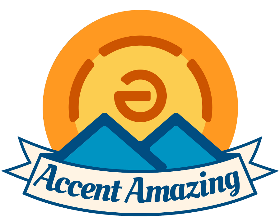
The logo shows a mountain with a sunrise with the phrase below it saying "accent amazing"
The visual & verbal pun
The name "accent amazing" is part of the phrase which describes what I do: "I make your accent amazing". However, with the logo and its mountain, you might be inclined to think of another image, an ascent up the mountain. The word "ascent" and "accent" are both visually and phonetically similar.
In addition, the journey of improving your accent is not easy, it is kind of like ascending a mountain, but much like the view at the end of the hike, the improvement you'll see in your accent is worth it.
The mountains
The twin blue mountains together form the shape of two "A"s, which are the initials for the company name "Accent Amazing". The original logo had snow-capped mountains which made the "A" shape more obvious.
The new logo removes the snow caps but still retains the mountain shape that suggests the "A"s. You could also say it looks a bit like an "M" which combines with the ə of the sun above to create the first two sound segments of "amazing" which is /əm/ as well as sounding like the interjection "um" when you're unsure of yourself
Which brings us to the
The sun and sound rays/waves
The yellow sky is filled with the sun and its sun rays, or rather, its sound waves. Both the old and the new logo feature a sun composed of the schwa /ə/ vowel, which is the most common sound in English, being about 12% of all English sounds.
In addition, the emanating rays are shaped like sound aves. There are more sound waves in the original logo but this has been simplified in the new logo while the overall shape has been retained.
Finally the lays have been darkened and lines thickened so that it's more clear what the logo does.
The other parts
Finally, the original logo's shading has been flattened so it translates better into a black and white line logo if necessary. While the detailed shading of the original logo had a nice look to it, it did not have the flat minimalist look I was going for and the logo did not do well at a smaller scale, hence the simplification.

Final thoughts
The new logo is a lot cleaner and simpler as well as easier to use practically. It brings the brand a more modern aesthetic. The text bit of the logo may still change but the visual part is done.
What are your thoughts? Were the visual puns and symbolism noticeable and clear? Let me know your thoughts in the comments.